|
I made my site by using a template, but I found that the template I chose, while very simple, was still too complicated for my purposes. I ended up deleting a lot of the html and using only very basic parts of the template, including the footer and the navigation bar at the top of the page. Initially, the template had a sidebar that expanded when clicked on, but I found this unnecessary when there was already a navigation bar at the top of the page.
I changed the number of tabs in the navigation bar to four. The first one links to the starting page, the second to an “about me” section, the third to a page of my own pictures, and the fourth to my list of desert island books. I made sure that each page could link to each other page, which was actually much easier than I anticipated it being. The most difficult part of creating the site was probably sizing my pictures correctly. There was a lot of guesswork involved. I’m sure that there was probably an easier way of figuring out how big my pictures needed to be, but my guess and check method eventually resulted in success. I didn’t have a grand vision of what I wanted from this project, because I am a realize and I know that using html doesn’t come naturally to me. Some parts of the site exceeded my expectations; I really like the way the background image looks, for instance, and I like the navigation bar with the font I choose for it. Some other parts didn’t go as well; I ran out of time working on my photo page and only included four. I meant to add captions to each one, but I could figure out how to do that in a way that would look good, so I ended up leaving the photos on their own. The link I included is to my Weebly blog. I think it looks a little awkward by itself at the bottom of my “about me” page, but I didn’t want to include it in the paragraphs on that page, either. If I was better at html and coding, I would have liked to make my home page a bit more polished, and I would have wanted to make my name a lot larger and in the middle of the screen. I also would have liked to create a photo gallery that looked nicer. The modes I used in this project are visual, linguistic, and spatial. The visual choice I made to include a background photo is probably the most significant visual choice I made. My intention is that it will make people enjoy looking at the site. My linguistic choices were not as well thought out as they normally are, because I was so focused on the design element. Overall, my intention with modes is to make an appealing site. I think my most noticeable design element is alignment, because I aligned most of the items on my pages to the left. In general, I tried to make my design as simple as possible, because I prefer sites that don’t force the audience to take in too much at once. I want my audience to perceive me as calm person who enjoys simplicity.
0 Comments
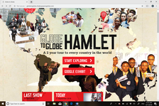 The site for Globe to Globe Hamlet, http://globetoglobe.shakespearesglobe.com/, has two intended audiences; those who are interested in seeing the show and those who are interested in donating. These audiences likely overlap to some extent. At the top of the page there are two places you can click to explore the page and see pictures from performances, and slightly further down the page there are links to the blog, the latest show, and other social media accounts, as well as links to prior years’ information. At the very bottom of the page there is a link to donate to Globe to Globe Shakespeare. A person using this website would likely be here to find out more about the show or donate to it. The purpose of this website is to provide information about Globe to Globe Shakespeare, including the current season and an archive of previous seasons. Along with providing information, the website serves the purpose of convincing people to watch the show or tell others about it, as well as make a donation to the cause. These purposes come across through the layout of the site, which provides links to more information on the play and for donations. Another purpose of the site is to promote the play on social media, as there are links to different social media platforms on the site and people are encouraged to connect with Globe to Globe Shakespeare. Since it can be accessed by anyone with internet access, this site exists within the context of the internet. Readers will likely access it on their phones or computers, and it is designed with the knowledge that readers are less likely to make it through large chunks of text on a webpage. The images used on the main page of the website draw connections to the traveling aspect of the performance. While it is not explicitly stated that each image is from a different place, most people would be able to use cultural and context clues to understand that the images are representing different parts of the world. This text has an implied author, Shakespeare’s Globe. While the text was really authored by a variety of people not explicitly named, the site is published by an organization called Shakespeare’s Globe, and the information presented is theirs. Shakespeare’s Globe uses photographs and videos of past performances to establish credibility. They also include a post about President Obama visiting, which serves as a sort of celebrity endorsement. The genre of this text, very specifically, is websites about Shakespeare performances. It includes many of the same elements as other Shakespeare drama sites, because it includes past archives, current shows, social media links, a donation page, an a performance schedule. Rhetorically, this site is presenting information of Globe to Globe Shakespeare performances in order to inform people, convince them to attend shows, and/or convince them to donate to the organization. The use of videos, photos, and links throughout the website provides a somewhat organized experience for the website user to find more information about any of those things. |
AuthorDigital Literacies student Archives
October 2018
Categories |
 RSS Feed
