|
To create my logo, I took the iconic image of Hamlet holding the skull and turned it into a silhouette. The photograph I used to do this is actually the one from our photo drive that was taken at the Nashville performance. I decided to use this photo because, although I tried to think of other iconic images and themes from the play, it felt most natural to use that one. There is something to be said for inviting audiences in with something familiar, even if we are trying to highlight what is different about this particular adaptation of Hamlet. For my site mock-up, I decided to make it as simple as possible. I knew from the beginning that I wanted to highlight the photographs, and I found that a clean and simple way of doing that was to use a photograph for each link to another part of the page. I chose to divide the page into six different photographs, which link to pages on adaptation, costumes, actors, interviews, venue, and reviews. At the bottom of the page, there is another navigation bar that leads back to this home page, to the archive home page, and to a photo gallery. The fonts I used are Lato and Playfair Display. Playfair Display is my serif font, and Lato is sans-serif, which I only used for the navigation bar at the bottom. There is a lot of black and white in my design; the words on the pictures are white, and the title and bottom navigation bar are both black. The background is white. The photographs add color to the page, although not a specific color. My intention in designing both the site mock-up and logo was to create something simple but compelling. I don’t like sites that are trying to do too much, and I think that my design has the necessary elements without crowding the page. Any audience can navigate the page with ease, and it appeals to people who are interested in visuals. I did not highlight the Nashville element of the show, but I think that the information on the adaptation and venue pages would sufficiently explain what sets this version of Hamlet apart from others, while the home page emphasis the global nature of Hamlet and what is the same about it everywhere. 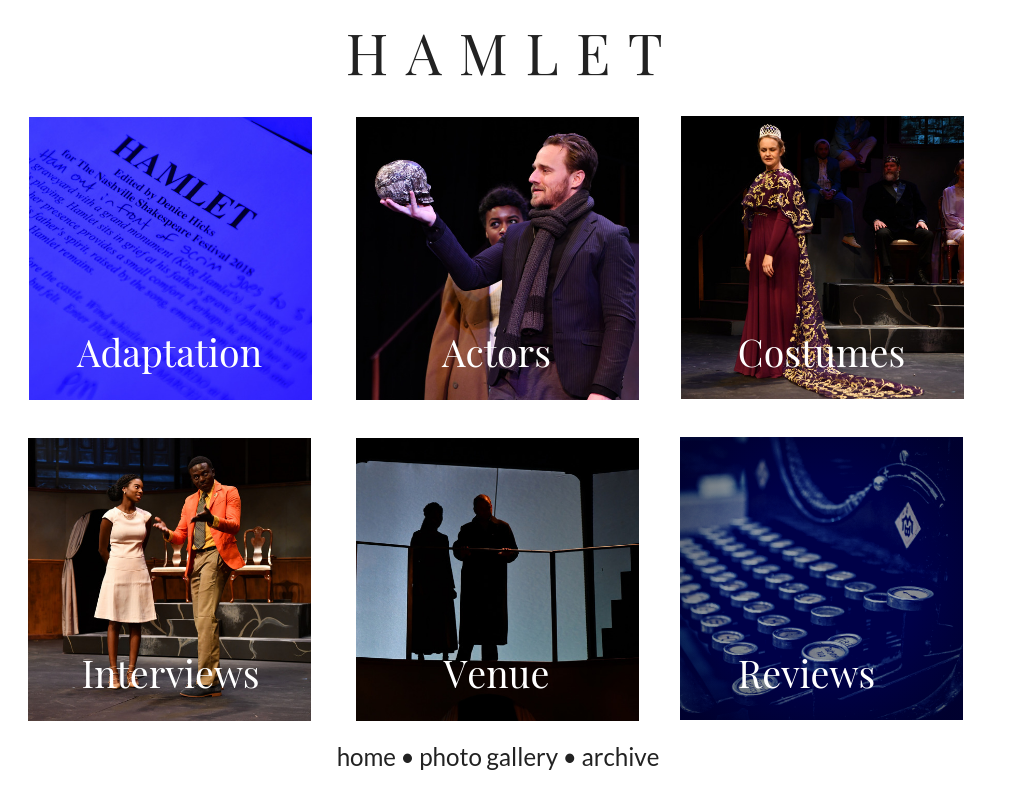
3 Comments
Allyssa Marino
10/29/2018 02:17:41 pm
I really like your logo and site layout! I love the simplicity of the layout and I think it will allow the site's content to speak for itself. As for the logo, I think its great because its an actual silhouette of a shot from the play, therefore its the most actually connected to the performance itself.
Jack Tucker
10/29/2018 02:18:51 pm
I'd vote for this page because of how prominently it features a variety of images while still looking organized. Looks great!
molly shea
10/29/2018 02:23:42 pm
It's definitely important to keep things clean and user friendly! I love this home page because of how it doesn't overwhelm the reader. Also, if we use this design, I would suggest including a drop down menu so that users are able to navigate between pages. Leave a Reply. |
AuthorDigital Literacies student Archives
October 2018
Categories |
 RSS Feed
